" height="17.999923152223392px" id="wVZNRk5v1" transform="translate(9.718 0)" width="17.669902775649575px"/><g d="M 0 0 C 4.879 0 8.835 4.029 8.835 9 C 8.835 13.971 4.879 18 0 18 Z" fill="transparent" height="17.999923152223392px" id="oZuFlkdb5" transform="translate(6.184 0)" width="8.834951474139757px"><path d="M 0 0 C 4.879 0 8.835 4.029 8.835 9 C 8.835 13.971 4.879 18 0 18 Z" fill="rgb(218, 64, 98)" height="17.999923152223392px" id="IiikZgo85" transform="translate(0 0)" width="8.834951480323639px"/></g><path d="M 2.683 0 L 2.747 0.064 C 4.436 1.783 5.379 4.119 5.367 6.552 C 5.355 8.984 4.389 11.31 2.683 13.012 C 0.964 11.3 -0.003 8.954 0 6.505 C 0 3.958 1.028 1.654 2.683 0 Z" fill="rgb(30, 0, 93)" height="13.012144446742262px" id="CBHDfgp4h" transform="translate(10.16 2.7)" width="5.36727425024361px"/><g d="M 0 0 C 1.277 0 2.54 0.233 3.72 0.685 C 4.882 1.127 5.951 1.789 6.872 2.636 C 7.761 3.454 8.478 4.447 8.979 5.556 C 9.465 6.637 9.717 7.811 9.718 9 C 9.717 10.189 9.465 11.363 8.979 12.444 C 8.478 13.553 7.761 14.546 6.872 15.364 C 5.951 16.211 4.882 16.874 3.72 17.316 C 2.53 17.77 1.27 18.001 0 18 Z" fill="transparent" height="17.999930534464635px" id="jhkgUcs2L" width="9.718446526607295px"><path d="M 0 0 C 1.277 0 2.54 0.233 3.72 0.685 C 4.882 1.127 5.951 1.789 6.872 2.636 C 7.761 3.454 8.478 4.447 8.979 5.556 C 9.465 6.637 9.717 7.811 9.718 9 C 9.717 10.189 9.465 11.363 8.979 12.444 C 8.478 13.553 7.761 14.546 6.872 15.364 C 5.951 16.211 4.882 16.874 3.72 17.316 C 2.53 17.77 1.27 18.001 0 18 Z" fill="rgba(218, 64, 98, 0.5)" height="17.999930534464635px" id="g9AELDm9v" width="9.718446526607295px"/></g><path d="M 53.702 18 C 52.492 18 51.434 17.745 50.526 17.235 C 49.632 16.738 48.901 15.984 48.425 15.066 C 47.948 14.129 47.709 13.027 47.709 11.762 C 47.709 10.496 47.963 9.386 48.473 8.432 C 48.977 7.484 49.74 6.705 50.669 6.189 C 51.608 5.663 52.692 5.4 53.917 5.4 C 54.554 5.4 55.19 5.49 55.827 5.671 C 56.443 5.835 57.03 6.093 57.57 6.436 C 58.064 6.748 58.311 7.208 58.311 7.816 C 58.311 8.244 58.215 8.597 58.024 8.877 C 57.851 9.13 57.564 9.278 57.26 9.271 C 57.057 9.271 56.855 9.238 56.663 9.172 C 56.488 9.091 56.249 8.976 55.946 8.827 C 55.654 8.666 55.351 8.526 55.039 8.408 C 54.756 8.304 54.456 8.254 54.156 8.26 C 53.264 8.26 52.58 8.556 52.102 9.148 C 51.64 9.724 51.41 10.57 51.41 11.687 C 51.41 12.805 51.64 13.66 52.102 14.252 C 52.58 14.844 53.264 15.14 54.156 15.14 C 54.49 15.14 54.785 15.098 55.039 15.016 C 55.294 14.917 55.605 14.77 55.97 14.573 C 56.204 14.455 56.443 14.348 56.687 14.252 C 56.862 14.17 57.053 14.129 57.26 14.129 C 57.562 14.129 57.809 14.269 58.001 14.548 C 58.207 14.827 58.311 15.181 58.311 15.608 C 58.311 16.216 58.064 16.668 57.57 16.964 C 57.023 17.31 56.427 17.568 55.803 17.729 C 55.118 17.912 54.411 18.003 53.702 18 Z M 35.782 18 C 34.456 18 33.293 17.745 32.29 17.235 C 31.287 16.709 30.514 15.978 29.971 15.041 C 29.427 14.088 29.155 12.97 29.155 11.687 C 29.155 10.406 29.427 9.296 29.971 8.359 C 30.514 7.405 31.287 6.673 32.29 6.164 C 33.293 5.655 34.456 5.4 35.782 5.4 C 37.107 5.4 38.27 5.655 39.273 6.165 C 40.276 6.674 41.049 7.405 41.592 8.359 C 42.136 9.295 42.408 10.406 42.408 11.687 C 42.408 12.97 42.136 14.088 41.592 15.041 C 41.049 15.978 40.276 16.709 39.273 17.236 C 38.27 17.745 37.107 18 35.782 18 Z M 35.782 15.165 C 37.65 15.165 38.585 14.006 38.585 11.687 C 38.585 10.52 38.338 9.65 37.845 9.074 C 37.37 8.498 36.682 8.211 35.782 8.211 C 33.913 8.211 32.978 9.37 32.978 11.687 C 32.978 14.006 33.913 15.164 35.782 15.164 Z M 22.099 18 C 21.584 18 21.155 17.849 20.812 17.547 C 20.485 17.246 20.32 16.802 20.32 16.215 L 20.32 1.785 C 20.32 1.198 20.484 0.754 20.812 0.453 C 21.155 0.151 21.584 0 22.099 0 C 22.598 0 23.012 0.151 23.339 0.453 C 23.683 0.754 23.854 1.198 23.854 1.785 L 23.854 16.215 C 23.854 16.802 23.683 17.246 23.339 17.547 C 23.012 17.849 22.598 18 22.099 18 Z M 7.08 18 C 5.776 18 4.563 17.851 3.44 17.552 C 2.318 17.237 1.403 16.797 0.693 16.232 C 0.445 16.05 0.264 15.859 0.148 15.66 C 0.049 15.444 0 15.178 0 14.863 C 0 14.448 0.124 14.083 0.371 13.767 C 0.636 13.452 0.933 13.295 1.263 13.295 C 1.445 13.295 1.617 13.328 1.782 13.394 C 1.964 13.444 2.179 13.543 2.427 13.693 C 3.097 14.123 3.821 14.458 4.58 14.689 C 5.306 14.888 6.107 14.988 6.981 14.988 C 8.071 14.988 8.904 14.805 9.482 14.44 C 10.059 14.075 10.347 13.552 10.347 12.872 C 10.347 12.357 10.076 11.942 9.531 11.626 C 9.003 11.311 8.054 11.012 6.685 10.731 C 5.149 10.416 3.919 10.033 2.996 9.585 C 2.088 9.137 1.419 8.581 0.99 7.917 C 0.578 7.253 0.372 6.448 0.372 5.502 C 0.372 4.457 0.669 3.519 1.263 2.689 C 1.873 1.842 2.707 1.186 3.763 0.722 C 4.835 0.24 6.04 0 7.377 0 C 9.721 0 11.652 0.589 13.17 1.768 C 13.418 1.966 13.592 2.174 13.691 2.39 C 13.805 2.588 13.864 2.839 13.864 3.137 C 13.864 3.551 13.731 3.917 13.467 4.233 C 13.22 4.548 12.931 4.705 12.601 4.705 C 12.425 4.706 12.25 4.681 12.081 4.63 C 11.932 4.581 11.719 4.473 11.438 4.306 C 10.761 3.875 10.134 3.552 9.556 3.336 C 8.995 3.12 8.277 3.012 7.402 3.012 C 6.395 3.012 5.603 3.211 5.025 3.61 C 4.448 3.991 4.159 4.522 4.159 5.203 C 4.159 5.602 4.266 5.934 4.481 6.199 C 4.712 6.448 5.084 6.673 5.594 6.871 C 6.124 7.07 6.867 7.278 7.823 7.493 C 10.067 7.992 11.677 8.631 12.651 9.41 C 13.64 10.191 14.136 11.262 14.136 12.622 C 14.136 13.684 13.839 14.622 13.244 15.436 C 12.667 16.249 11.841 16.879 10.769 17.328 C 9.713 17.776 8.483 18 7.08 18 Z" fill="rgb(30, 0, 93)" height="18px" id="cdcwirY_U" transform="translate(32.689 0)" width="58.31067427037016px"/></g></svg>)
Back
Customising the result distribution bar chart
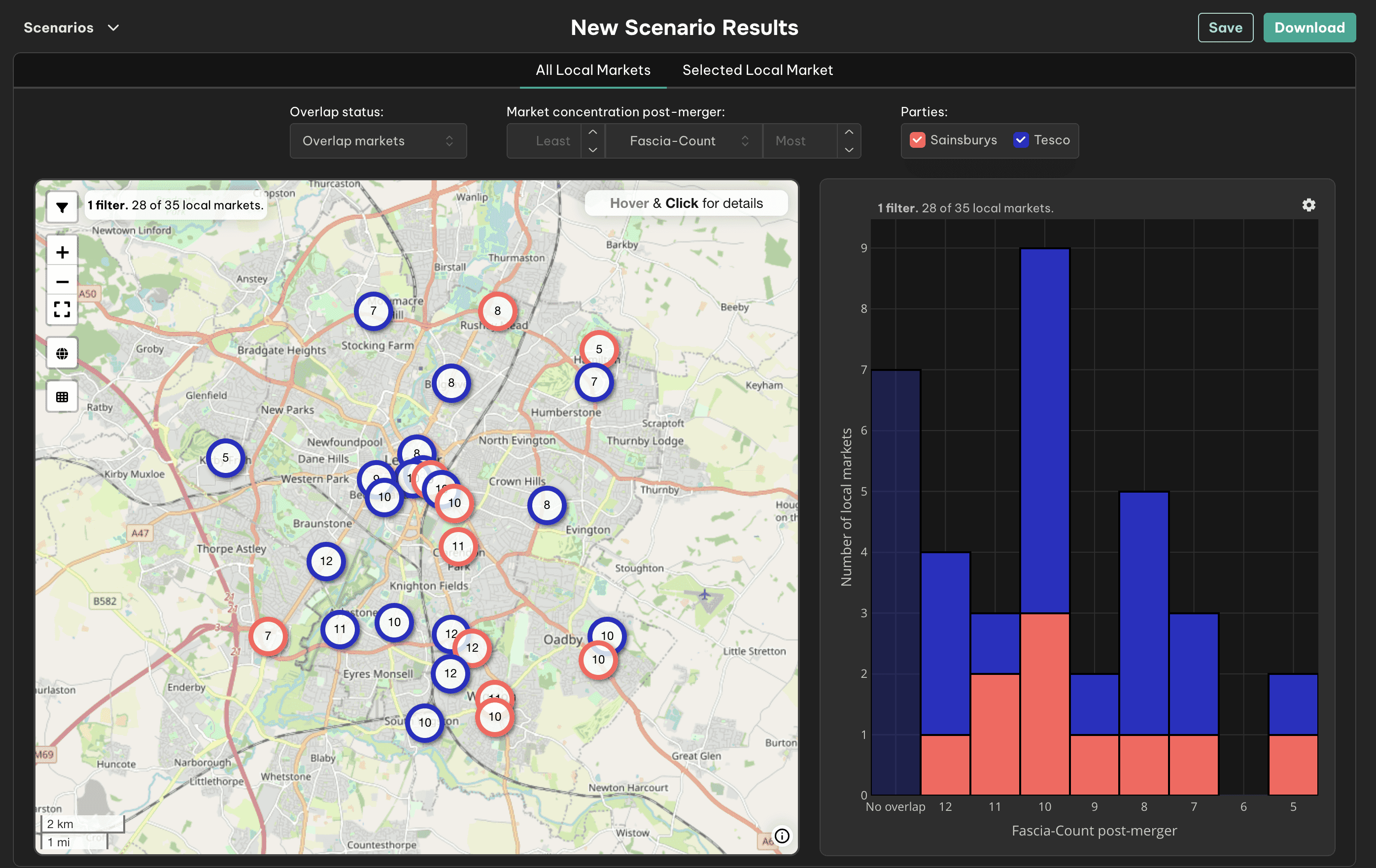
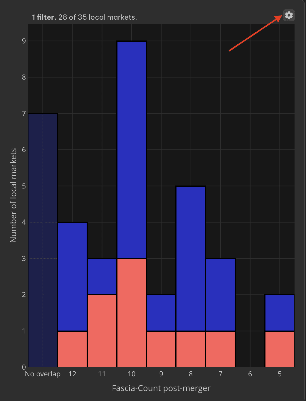
In the Analyse Markets view of Sloc Local, the bar chart on the right provides a summary of market concentration outcomes across all local markets in your scenario. It helps visualise how many local markets fall into each post-merger fascia-count or share-of-sites category, and gives quick insight into the overall competitive impact of the analysed merger.
What the bar chart shows
Each bar represents a group of local markets by their post-merger concentration
The height of each bar = number of local markets in that category
Colour shading indicates the parties present in those markets
The “No overlap” group captures unaffected local markets where the merging parties do not overlap
Default settings explained
Sloc Local uses smart defaults to help you focus on the most relevant results:
🔍 Filtered markets shown prominently
By default, the chart shows all local markets, but those not currently shown on the map are faded out.
This helps you keep focus on what you’re viewing geographically.
🎯 “No overlap” markets shown in a separate bucket
Markets where there is no competitive overlap are automatically placed in their own category on the far left of the chart.
Customise the bar chart with toggle controls
You can adjust the chart view by clicking on the "Settings" icon above the chart:
Show only filtered markets
Limits the chart to include only the markets currently filtered on the map
Useful when focusing on a region, subset, or concentration band

Include or remove the “No overlap” bucket
You can choose to merge all markets into a single scale - regardless of whether the market contains a Party overlap or not
Or keep “No overlap” separated for quicker comparison between affected and unaffected areas
